Now that animation has started I have been thinking more and more about my aesthetic, against advice, but because of time constraints the aesthetic will need to be further refined.
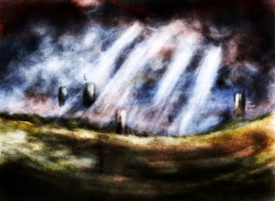
I had a go at creating a new background in a short space of time and learnt a few things along the way. While browsing a magazine I came across several artists who began their paintings in photoshop in black and white. The reason behind this is to get a grasp of the lighting and tonal values right from the get go. I used this as an opportunity to get texture into the image as soon as possible too by painting with a custom brush.

I added colour to the image using basic technqiues so the colours are not as rich as those as some of my other aesthetic attemps. The black and white layer is duplicated over the colour layer to help with intensity and depth. I also feel that some of the power in this black and white image has been lost but this is made up for with the colour.
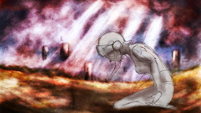
Now adding Zoe into the scene was a little tricky. This is the first attempt I have made at seeing how my actual lineart looks on top of the backgrounds I have made.
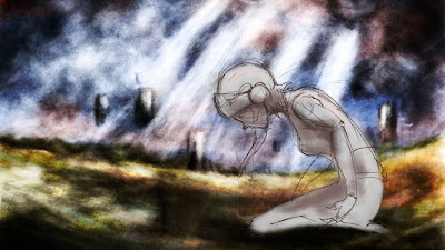
I'm quite happy with the way it is as a first attempt. I definately prefer coloured lineart to straight black lines but the colour of Zoe's fill could do with a little adjusting. Other than that my only thoughts are that the image lacks a certain amount of definition. I will continue to improve the level of detail in the backgrounds, but painting in black and white and use of texture will be added to the process. In addition to this although I like the atmosphere of the background the large amount of black is quite overpowering so I colourized the black and white overlay. It looks ok as an initial attempt:
Right, back to the light box I think...