Sunday 1 February 2009

Rolling Grass

The latest attempt at a moving background- same process as the old one but looped so it can run on forever. I've added music to add to the atmosphere but actually the soundtrack provided for this particular part of the film should be much more driven and a lot louder.


It's quite an improvement on the old one, and the fall-off plugin is working really nicely here. The next challenge will be to have objects moving into the scene and passing by the camera as it moves. This is quite an easy concept in after effects but it will have to match the aesthetic which may need further refining... I'm hoping that this process will also suffice for some of the scenes in the sky, particulary where Zoe is falling or rising through the clouds.

Aesthetics 3

Now that animation has started I have been thinking more and more about my aesthetic, against advice, but because of time constraints the aesthetic will need to be further refined.
I had a go at creating a new background in a short space of time and learnt a few things along the way. While browsing a magazine I came across several artists who began their paintings in photoshop in black and white. The reason behind this is to get a grasp of the lighting and tonal values right from the get go. I used this as an opportunity to get texture into the image as soon as possible too by painting with a custom brush.


I added colour to the image using basic technqiues so the colours are not as rich as those as some of my other aesthetic attemps. The black and white layer is duplicated over the colour layer to help with intensity and depth. I also feel that some of the power in this black and white image has been lost but this is made up for with the colour.

Now adding Zoe into the scene was a little tricky. This is the first attempt I have made at seeing how my actual lineart looks on top of the backgrounds I have made.


I'm quite happy with the way it is as a first attempt. I definately prefer coloured lineart to straight black lines but the colour of Zoe's fill could do with a little adjusting. Other than that my only thoughts are that the image lacks a certain amount of definition. I will continue to improve the level of detail in the backgrounds, but painting in black and white and use of texture will be added to the process. In addition to this although I like the atmosphere of the background the large amount of black is quite overpowering so I colourized the black and white overlay. It looks ok as an initial attempt:

Right, back to the light box I think...

Wednesday 14 January 2009

Flying in Two and a Half D

I'm late but it's finally time to animate and although its been talked about before it's finally time to face the problem of the moving background. In the animatic quite a few seconds worth of in perspective scrolling background are needed where Zoe flies really fast over some scenery.


Originally after effects was the only way I could think of doing this but then I was inspired by 'The YuYu' by Adam Philips. he has achieved something very similar in terms of animation to what I had envisaged for my own film. I can't embed it here so you can watch it on youtube here:


or in better quality on Newgrounds.com:

http://www.newgrounds.com/portal/view/310851


After watching this several times I decided that the ground itself was animated by hand and the mountains and other passing objects may have been also been animated but certainly on layers. Some things done here are achieveable in after effects, but for the ground traditional animation appears to be the only way to achieve this effect. So my first line test may well be that.

--------

I wrote all that yesterday and today- after consulting tutor Adam C it turned out that a similar effect more in keeping with my aesthetic was achievable with 3DS Max but the same process could also be done in After effects and seeing as I had desired to use as little 3D animation as possible I attempted it there instead. I decided to use Adam's process on my initial aesthetic design and animate it in " 2 and a half D ". I dunno if Adam came up with that term but its cool so I'm gonna keep using it as "2.5D".

So..here is my 2.5D attempt:


What your seeing is a combination of after effects' clever 3d camera on top of 2d images. I made a shot using this 3d camera travelling at high speed over my grass, which I took from one of the layers in my original painting, duplicated and spread out over a virtual 3d plane. This shot was rendered out as tiffs and re-imported on top of the cloud/mountain background. Motion blur is applied to make it look cool and fast.

You'll probably have noticed the grass is pulsating blue at the back there which is due to a plugin which adds realistic 'fall off' in colour and opacity as objects get further away from you from Videocopilot.net (thanks Tom!). I havent quite got it right but it will look better on the next test. Also next time I will not be looping my high speed grass, instead I will just make a scene of correct length for the camera to travel over. I'm really proud of this so thanks for everyone's advice today!

Aesthetic: Colour or Black and White?

While making this image below for the aesthetic mock-up, I had a go at changing the colours and changed it to black and white to reveal what I thought was a more striking and thoughtful image. Now I am torn between the two...


Looking at the action in the story this image seems far too tranquil, but on the other hand would probably take half the time to create which is good considering the large amount of work making this film will involve.

Character: Monster 4?

Right, I think that's finally it for the monster. The last and final change was his legs which now operate like bird legs and not human legs:


The suspention on the lower leg remains, and I'm hoping this will let me go even more nuts with the animation as he now has the ability to 'bounce'. A further adjustment- to keep everyone happy would be to make his feet more like claws or talons, but I'm happy with it for now...

Sunday 11 January 2009

The Skies Below: Layout Research

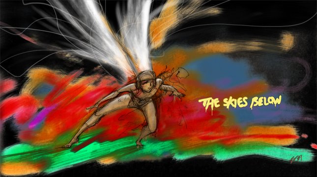
For this film, setting wasn't the first thing that came into the thought process and from the very beginning of fthe project it's really only existed as a half concieved idea in the back of my head. The layout and initial drawings in the animatic were created to look good in blue pencil and not much else. Now however, I've managed to gather some inspirational imagery that suits the mood of the story.
The reason layouts were taken for granted in the first place on this project was because they were mostly just cloud and could be drawn up at a moments notice. In these images however it's the colour that makes all the difference and is why my final film will have to include fully coloured paintings for backgrounds. Although it's a little strenuous on the workload, It will be worth it in the final film.


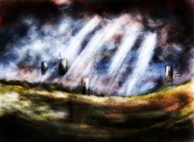
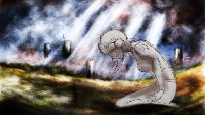
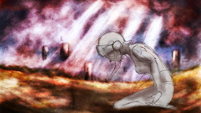
This first image is the closest to what I wanted for the ground though, perhaps a little too wet. The layouts for the earth in this film are essentially a lot of nothing, meaning that my main focus will be on texture when making the backgrounds look interesting. It made constructing sketched layouts for the animatic a little confusing. The next lot of images like the one above were selected from a book called Light in the Darkness. I should probably apologise for poor image quality- my scanner has had it I think...


The colour of this sky is exactly the colour concieved in the concept of this film. It's more of an evening sky though and I realise now that I got the colour wrong for the time of day which is supposed to be dawn, so a brighter slightly sunnier sky may well be the next step. I think I will still have to incorporate these colours somwehere though.

Grass was also present in all of the original concept. Even though the description clearly says wasteland bringing back to mind the first image, grass has a lot to offer in terms of setting the mood of the scene. I really like this long grass for the slower parts of the film- so a combination of this and the first charred angry image for when Zoe is being chased might be the answer.


If the ground should change to reflect the action on screen then why not the sky as well? A overcast sky like this would be fitting just before the low point of the film. I'm intrigued by the way it looks like it's on fire and the shafts of light would suit the epic tone of the film well.


Another image that shows off those tranquil pink/blue skies. I think I am drawn to this colour scheme because the skies can be made to look peaceful and angry without straying too far from the colour scheme itself. A little saturation on either the pink or blue and the addition of other complimenting colours, like in this image immediately transforms the peaceful atmosphere into a kind of uneasy one. But, It may not be enough to match the ferocity of the arrival of the Monster...

The Skies Below Animatic (latest version)

Finally an animatic on the blog! It’s taken a while but the animatic for The Skies Below has been under constant development and it’s still not finished yet. Still though, it’s about time I posted something on it so here it is:


As it stands it is still quite incomplete. It’s evident that the character designs are not present in all of the shots because like the animatic the designs were also constantly changing. Things yet to come for this animatic are the layouts, the redrawing of several other shots for some consistency, the animated version of the intro, part 2 of the crash sequence and the finished Father character. The music that plays for the intro is the first draft of the final score, the rest of the score is being used as a placeholder. This project can be described as very ambitious but I am very prepared to tone down the complexity of the action if necessary.

I’m hoping it makes more sense now as in the previous versions of this animatic the fast paced nature of the story made it unclear and a little un-readable in places. One durastic change did take place in the story where-by the God ‘character’ was removed from 2 shots as it took the story away from its original point; faith, rather than proving the existence of God. I think the faith aspect of this story comes across much more in this version and should be even clearer once everything is complete.

Friday 2 January 2009

Character: Monster 3

I made a few adjustments on the face of the monster character and ended up making it more complex. Looking back at fighter pilot helmets I added the breathing euipment that a fighter pilot wears in exactly the same place on the monsters face and split it under the nose for the mouth, creating a more prominent chin.

Purple was the original colour of the original concept, but it’s still dubious as to whether this will work with the colour of the layouts. The face is almost there but very reminiscent of Gundam but that’s probably just because of the winged ears which I would like to remain part of the design. Feedback suggests that the monster looks like a good guy and a bad guy which is ok, if you know what the story is about. But as I’m expecting the deeper meanings and metaphors of the story to stay hidden I’m going to try and make it look like even more of a bad guy.

Below is the monster’s body shape- it’s based off of the shape of a gorilla but it’s pretty similar to other monster designs out there.

The pistons that sit where the calf muscles would be on a human help to maintain the mechanical look throughout the body. I also added wheels on the feet and attached them to the heels as well. The feet were going to be 747 landing gear but they looked like roller skates...

This is a looser sketch I drew to resolve how the monster would take off from the ground. The start position for the 100m sprint is the best way to do this it seems. I think I prefer this slightly more exaggerated and twisted version.