Monday 29 December 2008

Character: Monster 2

While adding Zoe's helmet I decided also to incorporate the fighter pilot helmet into the monsters head design rather than using complicated bits of aircraft. For the monster I took note of some other examples of pilot helmet from the Warhammer 40K Space Marines and also Star wars TIE fighter pilots:


However, I decided in the end to stick as close to Zoe’s design as possible seeing as it is her grief and is a part of her, so it should look like her in part. I was going to investigate giving the monster an expression of grief kind of like the well known scream mask but it needs a little more thought.


The scream mask has a permanent expression that never changes which is nice but I want the monster to be able to shut its mouth. For now all I want the monster to do is evoke fear not only in my character but the audience, and I believe a more malicious expression will suit better in this case. So, here are some initial sketches of the new monster. I don't really want the design to move much from here apart from becoming simpler.


The kanji on the monsters forehead stands for sadness or grief (I think) but it will not be included in the animation. I also redrew the monster roar with the turbine according to the above design:


This is still really complicated but I feel it’s almost as simple as it is going to get. The aesthetic will be the last thing that will define the monsters appearence. The turbine mouth is going to have to stay for now...It only appears on screen for a little while...thankfully.

Sunday 28 December 2008

Character: Zoe 2

I decided to add a fighter pilot helmet to Zoe. Here is how it looks:


I feel that the helmet adds to Zoe’s design in that it makes her flying through the air more realistic and it will make animating her hair a lot easier. In certain shots the helmet will mean I will not have to animate her hair at all.

Tuesday 23 December 2008

Zoe’s Flying Machine 2

Last time I posted about this I said it would be the last one and it kind of is but not as well. I completed two more designs after the last one but the real problem behind them was that they had to fold down. However, with my limited mechanical knowledge I couldn’t really get them to do that. So I concentrated mainly on shape rather than mechanics.

This following image is the first design. I got some good feedback for this one but the reality was that it was too hard to animate. I was pretty sure that after 1000 frames of animation those seven ‘blades’ on the back edge of each wing was going to get boring and painful. It didn’t work with less blades either as the wings just looked unfinished and unbalanced. The centred engines however, looked good and were also in a practical position for animation. They are pretty simple even at this stage and allow for much more simplification. The size of the wings is also pretty good as it makes the whole system much more personal and means that I can get really close-up in shot and still be able to play with composition.


With that in mind, I went back to the drawing board and came up with this:


I like these a lot. I’d be happy to animate this wing even with the 10 feather extensions because they can be worked out really easily with the wing shape. The wing shape itself starts from a rectangle so shots with heavy perspective in them shouldn’t be too much of a problem. The engines sit inside the wing which is good but the overall wing size is far too large. The final wing design needs to be attached to Zoe’s back with a simpler harness than the one shown here. I did opt for an even more organic solution but the results were not as aesthetically pleasing as the this one. I tried again from a mechanical point of view first, but these results were not simple and didn’t serve at all for the poses and positions that would be needed in the film.

In the end I decided to use a telescopic set-up and for the rest I will have to rely on ‘artistic license’ to get the wings small enough for when she is running. Below are the latest sketches of the final wing design:


The wings are smaller and much more slender, they sit on the back and they can flex into an almost circular shape. These wings will be included on a separate version of Zoe’s completed model sheet with their full range of movement.

Sunday 21 December 2008

CHARACTER: Zoe

For the last few days now I have been struggling to finally define the face of Zoe. I knew roughly the way she would appear in the animation thanks to the storyboard but sketching her actual face proved to be more difficult than I expected.

I originally chose a female lead to set myself a challenge in drawing women and it really was a challenge. Setting myself this challenge was probably a bad idea but even though it’s actually quite possible to swap the gender of my protagonist at this point I have decided against giving up now. So, because I’m not quite ready for a full turnaround I thought I’d post my current efforts.
The sketch below was the first and served basically as a warm up. I loosely roughed in what I thought I wanted for Zoe’s facial features, but really I’m just happy that they kind of look like women...


After some refinement, I finally hit something I liked. You can see it mostly in the character at the top of this next image. This side profile reflects a lot of the characteristics shown in the storyboard. The profile of the girl directly below was also very close but next to the character description she seems much too old.


Then it was a case of turning that side profile around and sketching the whole of her face. Again I was most pleased with the face at the top despite it being emotion-less but it matches the original side profile best out of all of them. In the faces beneath I was playing with eye shapes, but after much thought I decided to stick with a heavy upper eyelid and an upside down semi-circle to get the shape of the eye. It may prove hard to manoeuvre for expressions.


An attempt at simplification and breakdown of proportions. I'm gonna drop the Lisa Simpson hair:


These last three sketches are the most recent. They are not perfect by all means but I am pleased with them to some extent. I had a go at drawing some emotion and I think they look alright, but there is Iess similarity, proportion wise, between them. I anticipate that there will be some difficulty in keeping Zoe on model but hopefully after some simplification and a completed model sheet things should get easier.


Almost there!

Sunday 7 December 2008

Zoe’s Flying Machine

The protagonist in my film, who has now come to be known as Zoe (thanks holly!) has the ability to fly using a machine that she wears on her back. Originally this flying machine was powered by four individual lasers that shot down to earth from four satellites in orbit. The lasers were completely theoretical in that they sent the effects of one environment into another. In the case of the satellites, they sent the weightlessness of space to Zoe on the ground allowing her to fly. It's kind of visible in this storyboard panel:

These lasers became really problematic during the later stages of plot development as they restricted movement in the character and would be too difficult to animate and apply effects to. Because Zoe’s ability to fly is integral to the plot, I have tried to come up with a new simpler flying system.

The following sketch is the latest attempt at a very mechanical and simple flying system. I’ve gone for solid rectangular wings with the propulsion originating from within the wings themselves. This design is mostly geared towards easy animation, as animating Zoe’s body in flight will be hard enough. There are four individual wings in this image but the rear two can be removed if necessary.


On the other hand, suggestions for a more biological flying system resembling actual wings like those on a bird inspired the next image. In the revised version of the animatic God repairs Zoe’s flight system at the end and although it is not fully shown it is suggested that God gives Zoe angel wings. Because of this I’ve tried to keep these wings mechanical for the most part to allow for their transformation at the end.

It’s probably worth noting that I’m still not happy with these designs. I think they need more refining. A balance needs to be achieved between the simplicity of a mechanical system and the complexity of a real set of wings. I stepped back into anime and mecha to take a quick look at some brilliant examples within the medium and found that fully biological wings (in their appearance) can work better than I’d imagined. So with all this new information it’s time to try again. Hopefully the next image titled ‘Flight Machine’ should be the last one.

Monday 1 December 2008

Aesthetics 2

As I was still feeling unhappy with the colour aspect of my aesthetic I went searching for some more ideas and I came across some inspirational imagery in a selection of comics a friend bought for me. The comics are completely in Cantonese, so I don’t know their titles, authors or artists. For me these images are just as dramatic and alive as Koji Morimoto’s concept art, but you’ll notice that the colour is vibrant in comparison although they might be considered pastel tones on their own. I think pastel tones will suit areas of the film as well as the grungy colours in Morimoto’s work but I haven’t really considered mixing two styles within one film yet, though done right I’m sure it would look good.


In these images the line art is not so bold and supports the colours rather than dominating them helping to add definition and clarity to the image only where necessary as is the case in the explosion below. I wouldn't mind the explosion in my film looking like this one...


These images have a kind of harmony about them. They are not as unsettling as Morimoto’s art and easier on the eyes but probably not on the creative process. I imagine that achieving such detail primarily through colour would suit layouts well, but not frames of animation because it would be too time consuming. However, it’s worth noting that my film is not so demanding on animation done on the light-box so this may allow for enough time to pull off a colour driven aesthetic like this one.


Either way, if colour is going to be included in a big way I think it will be wise to stick to a palette of colour. This will mean the animation won’t become too busy and will give me more of a chance of making the deadline.

Sunday 30 November 2008

Character: Monster

Here are some early designs for the monster character in my story. These images do not reflect the aesthetic I would like for my final film, but are focused more on form. They have too much detail at the moment but optimising the final designs for animation with the excess information in hand should ensure for a more thought-out character even after being simplified.


In the story the monster is created or rather grows out of the tears of the protagonist. She (the protagonist) is crying over the death of her father. The monster itself therefore is the manifestation of the pain and grief she feels over the loss of her dad. Because of this I thought it would be appropriate to have the monster character built out of the things that killed her father, in this case it would be built out bits of aircraft.
The huge wings are the most important part of the design for me and will probably be present in the final drawing- along with the monster's enormous size, you can see the comparison in the top image. I wanted to have other aircraft elements decide the form of the monster, but I think it will be easier if I decide the shape of this character beforehand and then assign various bits of machinery to the design to make it work. In the image below I drew the shape of the head before fitting the aircraft elements in. I really like the idea of the turbine mouth, so when the monster roars it roars literally with the ferocity of a jet engine.


Originally, I just wanted to animate a robot, but now the monster has taken on a deeper meaning and plays a much more important role in the story. I don’t think any of the theory behind the monster’s design will be so evident during the film’s showing but it will certainly help to develop these early sketches into a much more appropriate antagonist.


I am worried that the monster in the sketches above looks too human to be considered scary so I will be looking into animal forms to help rectify this issue. I’ll be checking out the Solid Drawing blog by John K for some useful tips on character design as well (thanks Rob!). The link is under 'technical links' on the right if anyone else is interested.

Saturday 29 November 2008

Aesthetics

I have some animation concept art by Koji Morimoto that I feel has a very interesting aesthetic to it. This image in Koji Morimoto's '0range' scrapbook was particularly inspiring.


The flowing line art, with its large curved strokes give the scene a really powerful atmosphere. The intensity of the line art is as important as the colour. The bold black lines give the scene a dark, brooding atmosphere and also capture movement which is why the image is so lively. It’s clear that it’s windy in the scene and the line art here gives that wind real power. The man in the bottom right almost looks like he is sailing on the grassy hills. I really admire the setting of this piece- it’s pretty much exactly what I wanted for parts of my story.

The enormous airship-like structure is more detailed when it comes to lines. The shorter layered strokes really add to the complexity of the structure but I’m not sure I would use the crosshatching method as much as it’s used here to shade objects. However, when I think of my monster character under this aesthetic I can see that the intricacy of the line art would suit the monster well as well as add to its darker nature as the antagonist. There aren’t many colours used here and the colours that are present are contrasting but obscured by the heavy line art- I think a similar approach to my film would be beneficial because it creates the right atmosphere but it may be hard to achieve in such a short space of time.

I’ve added a couple more images by Koji Morimoto that have a similar aesthetic to the one above, the liveliness in these images comes more from shape and form as there is no colour. I wasn’t really interested in creating an animation without colour or in monotone before but after seeing these images I feel much more confident about it as a possible art direction for my film.


The shape and form of the image below is well suited to the God character in my story, i had imagined that he would be formed out of large intricate, ever-changing flowing lines just like the ones here.


Thursday 27 November 2008

Influences

When I came up for the concept of this film I really tried to avoid any kind of influence. My aim was to come up with something completely original (even though that’s impossible) in terms of design but now that the storyboard and animatic are in process the influences have begun to show.
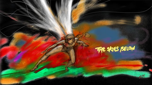
My influences for my film appear to be centred on anything epic. Through the whole process of developing the concept of the story, the presence of flight has remained constant. I really enjoy flight, whether it is flying machines or flying superheroes, spaceships or rockets- anything that flies in the sky or in space is awesome.

I can really appreciate flight in ‘anime’. Gundam, Macross and Eureka 7 are some good examples of anime that I have seen recently that make good use of flight with machinery or mecha. Some critics don’t rate Japanese anime highly, but I find that the cinematography used with flight in anime is epic and I’m pretty sure this has formed a lot of my motivation for pursuing a flight orientated third year film. On a side note I want to make clear that although I appreciate anime’s visual aesthetic, I have no intention of replicating it, only the shot and direction.


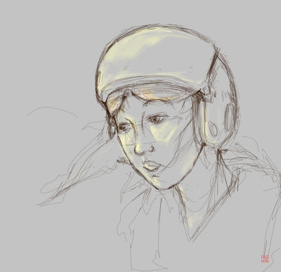
On top of that is the flight of able bodies like Kung-Fu heroes and Marvel superheroes. Wire-action in Kung-fu movies for me is epic. It might be an exaggeration of a martial arts form but the form and posture held by these heroes as they defy-gravity begs to be marvelled at, at least to me anyway. I know that it’s mainly for this reason that my main character does not fly in a plane or a spaceship. I want to show off the human body in the same way that Kung-Fu superheroes do.


The other thing I wanted to utilize in this animation was speed. The film will be epic if it’s happening at speed. My favourite thing in a film is a chase sequence and the faster they are, the more exciting they are. I like the car chase in Ronin, but as a combination of cool machinery, flight and ridiculous speeds- it’s all about Pod Racing.


There is a chase in my story and I think that this is the best way of making full use of speed as a tool for generating excitement and making the overall film epic. So that’s my influences and intentions simplified. Generally if it can be described with the words ‘cool’ and ‘awesome’ and is remotely sci-fi, then it’s in there somewhere.