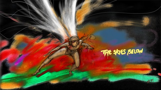
For this film, setting wasn't the first thing that came into the thought process and from the very beginning of fthe project it's really only existed as a half concieved idea in the back of my head. The layout and initial drawings in the animatic were created to look good in blue pencil and not much else. Now however, I've managed to gather some inspirational imagery that suits the mood of the story.
The reason layouts were taken for granted in the first place on this project was because they were mostly just cloud and could be drawn up at a moments notice. In these images however it's the colour that makes all the difference and is why my final film will have to include fully coloured paintings for backgrounds. Although it's a little strenuous on the workload, It will be worth it in the final film.

This first image is the closest to what I wanted for the ground though, perhaps a little too wet. The layouts for the earth in this film are essentially a lot of nothing, meaning that my main focus will be on texture when making the backgrounds look interesting. It made constructing sketched layouts for the animatic a little confusing. The next lot of images like the one above were selected from a book called Light in the Darkness. I should probably apologise for poor image quality- my scanner has had it I think...

The colour of this sky is exactly the colour concieved in the concept of this film. It's more of an evening sky though and I realise now that I got the colour wrong for the time of day which is supposed to be dawn, so a brighter slightly sunnier sky may well be the next step. I think I will still have to incorporate these colours somwehere though.


If the ground should change to reflect the action on screen then why not the sky as well? A overcast sky like this would be fitting just before the low point of the film. I'm intrigued by the way it looks like it's on fire and the shafts of light would suit the epic tone of the film well.

No comments:
Post a Comment