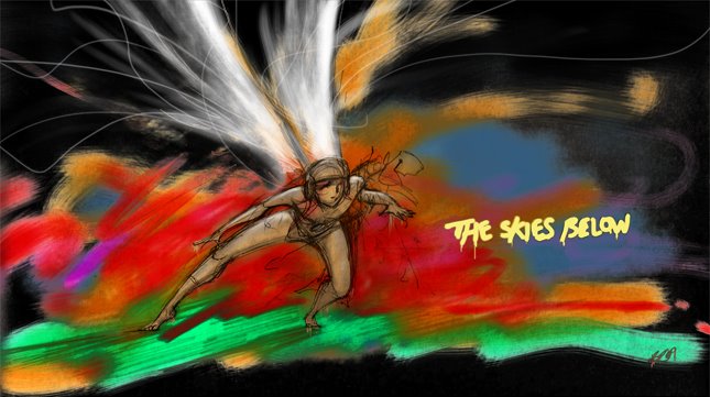
As I was still feeling unhappy with the colour aspect of my aesthetic I went searching for some more ideas and I came across some inspirational imagery in a selection of comics a friend bought for me. The comics are completely in Cantonese, so I don’t know their titles, authors or artists. For me these images are just as dramatic and alive as Koji Morimoto’s concept art, but you’ll notice that the colour is vibrant in comparison although they might be considered pastel tones on their own. I think pastel tones will suit areas of the film as well as the grungy colours in Morimoto’s work but I haven’t really considered mixing two styles within one film yet, though done right I’m sure it would look good.

In these images the line art is not so bold and supports the colours rather than dominating them helping to add definition and clarity to the image only where necessary as is the case in the explosion below. I wouldn't mind the explosion in my film looking like this one...

These images have a kind of harmony about them. They are not as unsettling as Morimoto’s art and easier on the eyes but probably not on the creative process. I imagine that achieving such detail primarily through colour would suit layouts well, but not frames of animation because it would be too time consuming. However, it’s worth noting that my film is not so demanding on animation done on the light-box so this may allow for enough time to pull off a colour driven aesthetic like this one.

Either way, if colour is going to be included in a big way I think it will be wise to stick to a palette of colour. This will mean the animation won’t become too busy and will give me more of a chance of making the deadline.

No comments:
Post a Comment